

Subur Mitra Sukses
Time Frame
Early 2026
Role
UI/UX Designer
Platform
Website
Introduction
Suburmitra Sukses is an FMCG distributor based in Indonesia, handling the distribution of everyday consumer goods across multiple regions and retail points. Before this project, the company had no proper website — only a plain text page with no structure, no visual identity, and no way to credibly represent their business online. I was brought in to design and build their web presence from scratch.
Background Story
The client was actively growing their distribution network and needed a professional digital presence to support business development — reaching potential partners, retail clients, and job candidates. The website needed to serve multiple audiences at once: B2B clients looking for a distributor, job seekers browsing openings, and partners wanting to understand their distribution coverage.
Team
Worked independently as the sole designer. Direction was aligned directly with the client, with content inputs from their internal team.
Defining the Problem
How might we create a digital presence for Suburmitra Sukses that feels credible and business-ready? One that serves distributors, job seekers, and retail partners from a single website?
Process
Define → Structure → Visual Design → Delivery.
Mapped out the three core audiences and their needs, then structured the site into three focused pages — landing, jobs, and distribution. Built the visual system from scratch in Figma: typography, color palette, component library, and page layouts designed to scale across all three pages.
Research and Ideation
Looked at established FMCG distributors and logistics companies across Indonesia and the region to understand how credibility is communicated in this space — clean layouts, clear service areas, prominent contact CTAs. Key insight: B2B company websites need to answer three questions fast — what do you do, where do you operate, and how do I reach you. This shaped the information hierarchy across all three pages.
Result
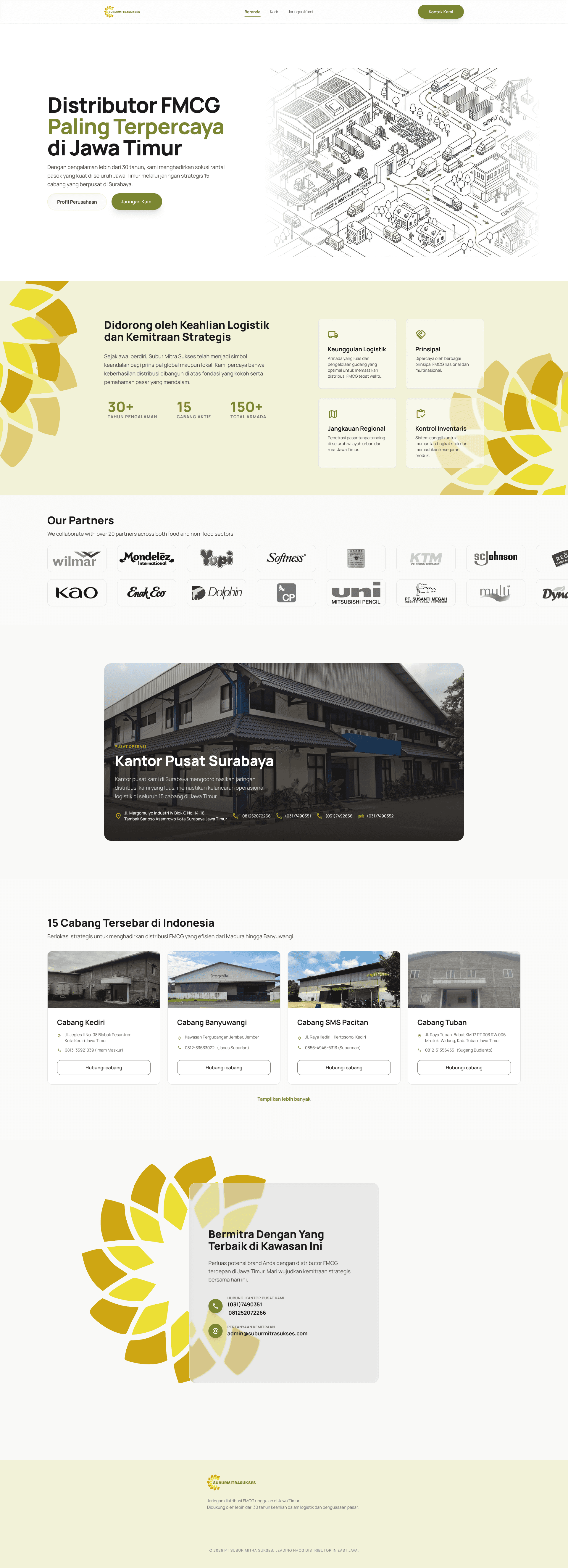
Landing Page — Full Scroll

Landing Page — Company Overview

Job Listings Page

Distribution Network Page
Challenge and Most Interesting
The main challenge was designing for three distinct audiences — B2B partners, job seekers, and retail clients within one cohesive website. Each needed a different tone and information priority, but the visual system had to feel unified. Balancing clarity for non-digital-native users with a professional B2B aesthetic was the most interesting tension to navigate throughout the project.
Key Takeaways
B2B company websites live or die on information clarity, not aesthetics. Designing for multiple audiences within one site requires a strong page structure strategy before any visual decisions. Even without user testing, competitive analysis of established players in the same industry surfaces strong structural patterns worth borrowing. Building a visual system from scratch for a client with no prior brand is an opportunity to set foundations that will scale.